- I'm Curious with Roey
- Posts
- I'm Curious: Uniform Rankings and International Spirits (Edition 42)
I'm Curious: Uniform Rankings and International Spirits (Edition 42)
This week, I dig into my fascination with uniforms and rank my favorite new NWSL kits, plus we go international with part two of a Spirit team preview.
Roey Hadar
February 27, 2026
Orlando Pride’s Marta wearing the club’s new “Unity Kit." Where does it land in my rankings of new uniforms? Keep reading to see. (Photo via Orlando Pride)
Welcome back to “I’m Curious!”
It’s hard to believe that by the start of next week, it will be March.
And that means there are sports to look forward to!
But before we do that, ahead of a new season, I want to offer a quick re-introduction as new people come onboard.
By afternoon and evening, I am a TV news producer, covering politics and everything else unfolding in the U.S. and the world for MS NOW, the former MSNBC. I work on shows that convey the opinions of the hosts so I follow their lead. I’ll give you the truth, but with my take baked in.
But on mornings and weekends (and the occasional off day,) I cover sports, primarily soccer.
I am entering my third season doing this, having started in mid-2024. I am based in DC and it started with coverage of the NWSL’s Washington Spirit as the anchor, but there has been no shortage of variety in the 40+ editions to date: hockey, WNBA, G-League basketball, the Savannah Bananas, pro wrestling… even a couple of drag performances have made it in.
You can expect coverage of every Spirit home game I am able to attend, which will be most of them, but this is a freeform canvas, so anything can pop up. There will likely be road trips to see other teams, stints covering other stuff, my thoughts on big stories in other sports, samples of my work from my day job, and of course, something good I ate.
It’s a major source of joy for me to make this newsletter. I hope it brings you anywhere close to the same level of joy to read it.
All right, coming up, we have part two of my Spirit media day endeavors, but we got another topic to cover first.
At the same time, don’t hesitate to use the Table of Contents if you want to hop around.
Table of Contents
But first… here’s Peach, my dog, and the mascot of this newsletter!

Peach, the mascot of this newsletter, curious if this picture would work if she set up a dating profile.
The Most Curious Thing This Week
It’s uniforms!
I love every sort of detail about sports uniforms. From fonts to number placement to art to their place in culture, I truly cannot get enough.
So a day like Thursday, when each of the 16 NWSL teams rolled out at least one new uniform, is an absolute bonanza.
Before I jump in, I want to at least explain where I come from with uniforms. What it means is my take will not necessarily be your take. Things I think are amazing may look hideous to you and vice versa.
The good news here is that even the worst uniform I saw rolled out is at the very least acceptable. Nobody is getting savaged.
But I tend to follow one rule: Go crazy!
I am a maximalist when it comes to graphic design and uniforms. Make it busy, make it colorful, make it garish. I want colors that really pop, thick lettering, big designs on the jerseys.
There are exceptions for teams that are traditional. If you have been around for a century, you don’t need to change your Yankee pinstripes or your Celtic green.
But beyond that, have fun.
Let me pull a couple of examples.
MLB’s San Diego Padres have regular uniforms that are unique in their brown, tan and yellow color scheme, but generally hideous.
Nostalgic Padres fans love the return to the classic colors for the Friars, but to me it’s a downgrade from their dark blue, orange and white of the late 1990s, and while there are ways to maybe salvage a cursed combination of colors here, this ain’t it. Blech!

A San Diego Padres road jersey, with the name of Fernando Tatis Jr. and his number 23 on the back (image via MLB and Fanatics)
However… they have also deployed arguably my favorite baseball jersey in ages, their incredibly garish City Connect jersey, primarily white with bright pink, light green and yellow touches.
Does it scream Miami Vice way more than it does San Diego? Absolutely.
Do I care? Not in the slightest.
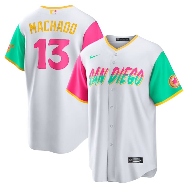
A San Diego Padres City Connect jersey, with the name of Manny Machado and the number 13 on the back (image via MLB and Fanatics)
Efforts to embrace the minimalist and the simple, in my mind, equate to making things worse.
Take the NBA’s Toronto Raptors. Which of these uniforms tells more of a story? Speaks to you more?
Is it this one?
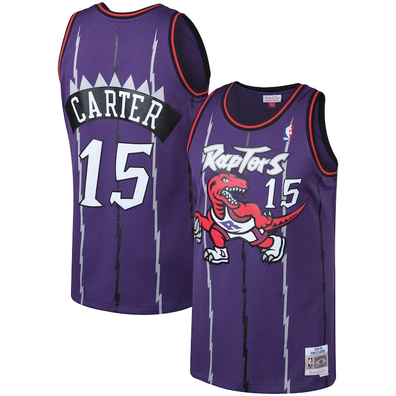
A 1990s-era retro Toronto Raptors jersey with a number 15 for Vince Carter on the back (image via NBA and Fanatics)
Or is it this one?

A present-day white Toronto Raptors jersey for customization with a generic “Your Name” and number 00 on the back (image via NBA and Fanatics)
If you picked the white one, which is their current primary uniform, I will send your room temperature water and unsalted crackers over as soon as I can.
The purple one, of course, was their original uniform from the 1990s, when maximalism ruled the roost for NBA jersey making.
There was zero need for a giant deer on the Milwaukee Bucks’ uniforms or both a giant bird and a color gradient on the Atlanta Hawks' uniforms, but it looked awesome, so they did it anyway and I love it.
So as we jump into these NWSL uniforms, I won’t do all of them, but I will give you my worst one and my top 5 (and maybe an honorable mention.)
Let’s get started!
2026 NWSL New Uniform Rankings
My apologies to the team with the worst of the 18 new uniforms…
18. Denver Summit (secondary)
Sorry, Denver. Somebody had to be last.
Expansion team jerseys are usually simple, so I’m not going to knock them too much for this. And their primary jersey is quite good, relying on a nice, simple green that emphasizes their primary team color well.
But… the second one being a plain white with green sleeves and bits of light blue is less a criticism of what they did as much as one of what they could have done (and may well still do in years to come.)
Their logo is beautiful, detailed and busy—a shining counter to the minimalist trend.
Based on what another expansion team did (spoiler), I now realize that teams can be creative from the jump, so I have to knock them for not doing something more ambitious that played into the striking mountains and beautiful skies in and around Denver.
Still, their kit is not ugly by any means and would be more wearable for fashion and in daily life than a lot of the others.

Denver Summit's Eva Gaetino wearing the team’s secondary “Summit Snow Kit” (image via Denver Summit FC)
Other ones I didn’t love included Portland, Seattle, and Utah, even separate from its sponsorship by the unfortunately-named America First Credit Union. (The credit union adopted the name in 1984, far removed from its use as a political slogan for Donald Trump and as the name of the anti-Semitic Nazi sympathizer movement leading up to World War II.) Still, hard sell for the average diehard NWSL fan.
Utah tried to go busy with their kit, which I respect, but with so much of it being monochromatic, it all blends together and doesn’t work for me. I admire them for fitting three kinds of animals (a lion, bees, and an eagle) on there, though. They tried, at least.

Kameron Simmonds of the Utah Royals wearing their new “Swarm Kit.” (Photo via Utah Royals FC)
Now let’s start moving up the list. We'll skip a generally strong middle tier, but I do have an honorable mention before we get to the top 5.
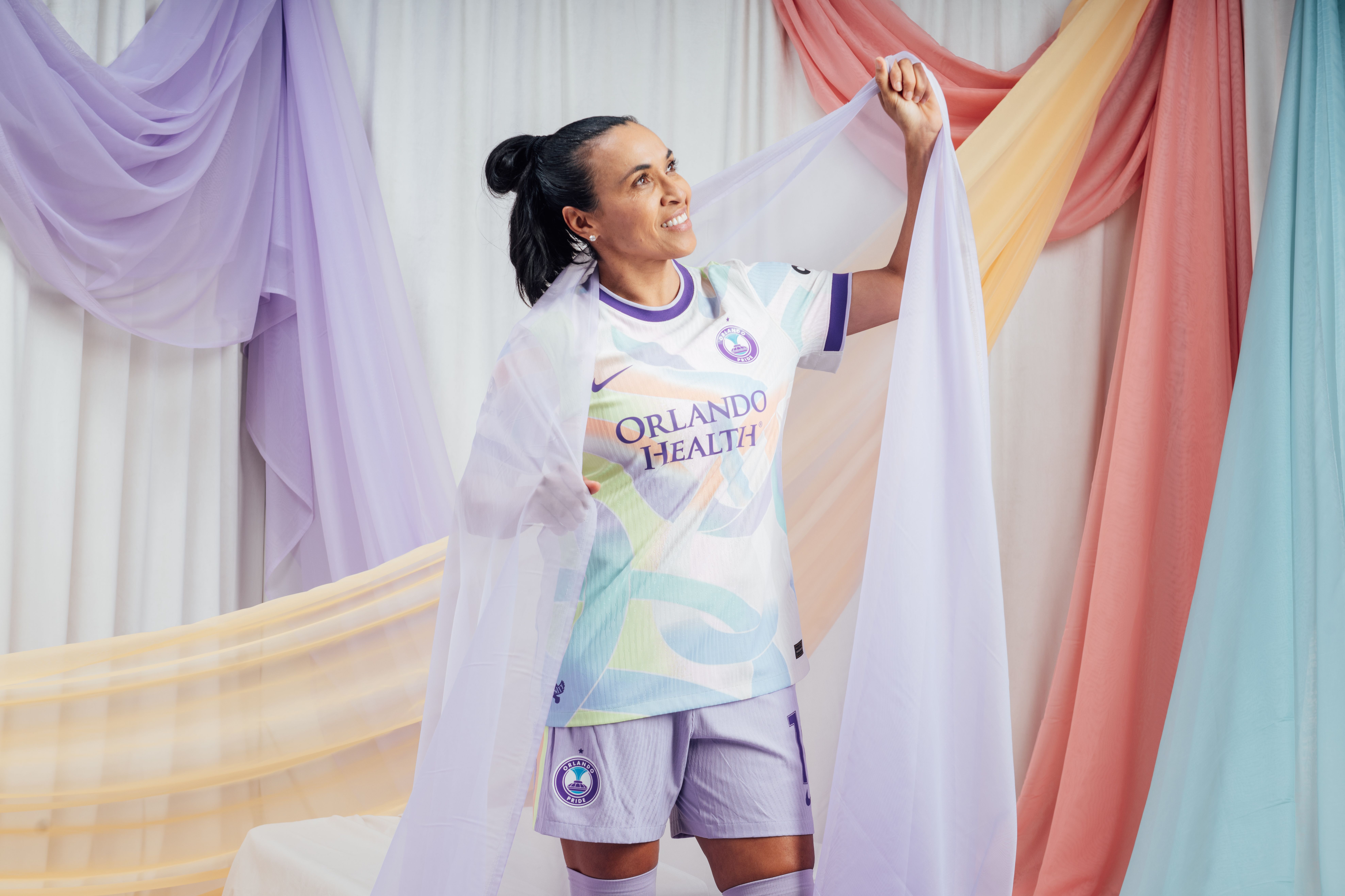
HM: Orlando Pride (secondary)
Orlando’s uniform certainly tries. It is colorful, with a depth that tricks your eye into seeing an extra dimension. It includes their primary purple, other colors associated with them like the citrus orange and the light blue that echoes the fountain on their crest, plus some yellow as well.
Off the bat, I like it but don’t love it, and it could grow on me, but it’s still right outside the top five because Orlando’s kit has a deep meaning.
Most NWSL kits have some sort of name and this one is the “Unity Kit.”
In their announcement about the kit, the Pride explicitly tied their kit to the tenth anniversary of the Pulse nightclub shooting, when a gunman killed 49 people and wounded 58 more at a gay bar as it held a Latino night in the wee hours of June 12, 2016.
“Featuring a vibrant pattern of interlocking ribbons, the Unity Kit honors the strength, togetherness and unbreakable spirit that defined the Orlando community in the aftermath of the Pulse Nightclub tragedy ten years ago,” the Pride’s release said.
Their announcement included a pledge to donate $20,000 from sales of the new kit to The Center Orlando, which runs the Orlando United Resiliency Services (OURS) program, providing support for the LGBTQ+ community.

Orlando Pride’s Marta wearing the club’s new “Unity Kit” (image via Orlando Pride)
5. Racing Louisville (third kit)
Did you know that Louisville’s Omega Mirror Products actually is the world’s top manufacturer of disco balls? Or that during the peak of the disco era, 90% of the world’s disco balls came from their Louisville factory?
It’s not often a sports jersey can teach you something, but Racing Louisville’s third kit does that. Dubbed the “Disco Kit,” it looks good too.
Racing took my call to have fun and go crazy and seem to have run with it, having a textured, black kit topped with streaks of green and purple, with thin lines cutting through each, doing a credible job of resembling how lights looked like at a disco.
The Racing crest, in white, pops out, and the GE Profile sponsorship doesn’t really overwhelm the design of the jersey, at least as far as sponsored soccer kits go.
Racing tends to do well with its kits, so this isn’t a huge surprise, but well done here.

A close-up shot of Racing Louisville’s disco kit, accompanied by a roller disco skate (image via Racing Louisville)
4. Chicago Stars (primary)
This is one where I had to override my original reaction, which was, and I quote, “booooooooooooring.”
Because I saw the colors, and that they were actually bright and popped off the jersey. And how they took a classic soccer jersey design and went for the right colors, ones that convey the Chicago flag, with its light blue and red, as well as the Stars’ primary dark blue.
It’s one that started to grow on me quickly, and where I think the initial reaction was tied more to the club’s relatively lackluster performance than anything else.
They may not necessarily win a ton in these kits, but they’re gonna look good trying.

3. Gotham FC (third kit)
A GIANT THING TAKING UP A BIG PORTION OF THE JERSEY HELL YEAH!!!
My hometown club went to the “vintage Toronto Raptors” school of design, going with a uniform that’s basically... a giant Statue of Liberty meets “Max Headroom”, with funky lines covering the entire jersey.
Gotham also made the gutsy choice to ditch the usual Statue of Liberty teal/green and black color scheme for one tied to New York City’s blue, white and orange flag.
It’s got everything: colors, patterns, a giant Statue of Liberty… it may well be New York’s hottest club as described by Bill Hader’s Stefon on SNL.
The whole thing was risky, but it’s loud and artsy and fun: so much of what New York City is.
(And don’t worry, New Jersey-based fans, before you think Gotham is abandoning their New Jersey ties, don’t forget that Liberty Island is well on the New Jersey side of the border, and it took New Jersey gifting the land for the Statue of Liberty to be part of the state and the city of New York.)

Gotham FC’s Midge Purce posing in the club’s new “Lady Liberty” third kit (image via Gotham FC)
2. Boston Legacy (secondary)
It’s the early 1990s. New Kids on the Block and Marky Mark and the Funky Bunch are the coolest bands in the world.
And everything looks like what’s now Boston Legacy’s secondary jersey.
Their black base is plainer than the one Racing Louisville used but the colors are incredibly loud. Yellow, pink, orange and green all over the place. The color splotches look like puzzle pieces, with street lines carving through some, black bars and bricks popping through others.
The team says the colors and shapes are inspired by Boston’s neighborhood and inspired by Boston Common, the oldest city park in the U.S.
I’ll be honest, it’s not the first thing I think of when I think about Boston, with its Irish ties, its revolutionary history, and its staid, traditional New England culture.
But Boston has long been a colorful, multicultural city and this jersey celebrates that.
Definitely a big step forward from the “too many balls” promo, that’s for sure.

1. Washington Spirit (primary)
I try not to let it get in the way of my coverage, but on this specifically, I am a homer. As a DC-area resident, I love anything cherry blossom being folded into a sports uniform. The Nationals nailed it. The Wizards made it look pretty cool.
But none of them leaned as emphatically in as the Spirit, who made this their new primary jersey.
The team has increasingly folded green into their color scheme but this is a helluva splash to make.
It looks less like a jersey than a shirt with a work of art on it. The multiple shades of green turn into some classic pointillism up close, and pink flowers pop off the green canvas. There is a bit of black up near the Spirit crest, which makes it kind of disappear a little bit into the jersey.
The jersey is broken up on the back by a block of dark green so jersey numbers can appear clearly, but the pink names and numbers pair well with it.
It’s garish. It’s gaudy. It even kind of resembles Kehinde Wiley’s presidential portrait of Barack Obama hanging in the National Portrait Gallery.

“President Barack Obama,” a portrait of Barack Obama by artist Kehinde Wiley that is on display at the National Portrait Gallery in Washington, DC (image via the Smithsonian Institution and the National Portrait Gallery)
To me, it’s a perfect jersey for an ambitious club representing a vibrant and green city like DC.

Washington Spirit’s Gift Monday posing in the club's new “Spirit in Bloom" primary jersey (image via the Washington Spirit)
My Reporting
I do still have more from Spirit media day last week. If you missed the first part of that, head back to the last edition of the newsletter.
I figure we can honor the end of the Olympics and the upcoming start of the Paralympics by going with previews that focus on international players with the club.
Here are a couple more snapshots of some folks who will be a part of the Spirit’s 2026 season.
Le Amiche Italiane – Sofia e Lucia
Covering the Spirit can often feel like covering the United Nations.
Of the 23 players currently on roster with the Spirit, 13 of them are from outside the United States, with 10 different countries represented.
Last season, Spirit forward Sofia Cantore became the first Italian to play in the NWSL, transferring in from Italian club Juventus.
Most other international players on the Spirit had somebody else to speak their language with—several players from Canada, France and Côte D’Ivoire spoke French, players from Nigeria and the UK could speak English, players from Mexico and Colombia could speak Spanish with each other and with Spanish coaches. No luck for Cantore, who was sola as the only Italian.
The Spirit remedied that issue, signing Italian defender Lucia Di Guglielmo from AS Roma. The 28-year-old outside back is set to play stateside for the first time, and she told me it’s definitely different here.
“I’m trying to adapt as fast as possible to all the new [stuff] and everything but the team is really helping me, so it’s good,” Di Guglielmo said.
The American game is known for its transition play, as teams love to win back possession and then outrun opponents down the field to quickly create chances.
Di Guglielmo said she was ready for that, but a couple other things stood out.
“The team loves to play the ball if there is space. And there is to be a lot of spaces, so that’s really good.”

Washington Spirit defender Lucia Di Guglielmo during training in Leesburg, VA, February 17, 2026.
And then there’s the matchups.
“And of course, for me as a defender, the 1v1’s every time are so challenging and that’s what I love, actually.”
When I pointed out to Di Guglielmo that there are definitely some fast forwards in the league and that she was sitting next to one of them, Cantore chimed in.
“Here they are very fast. I’m fast, but here they are very fast,” Cantore said.
Even with a few months of NWSL play under her belt, Cantore said she feels challenged even as an attacker.
“It’s difficult also for me. Because I think in this league the strength and the physicality is very high for all the players.”

Washington Spirit forward Sofia Cantore battling for the ball with Orlando Pride defender Kerry Abello during a game last October.
Both Cantore and Di Guglielmo have played for the Italian national team, often dubbed Le Azzurre for their blue uniforms. But this is the first time the two have been club teammates.
“I’m really happy. Like, in Italy, like, I would always want to play with [Lucia],” Cantore said.
“I was like, surprised, because another Italian is something really good for me. And also having her as a person, as a teammate, I really like her.”
Di Guglielmo feels the same way.
“It means a lot, absolutely. And it helped me so much. And of course, it’s like I have a little bit of Italy with me.”
One thing that seems to have helped both of them fit in: good vibes.
SOFIA CANTORE BACKHEEL GOAL ‼️
— NWSL (@nwslsoccer.com)2025-09-28T19:00:14.022Z
Cantore credited the vibes for fueling two of her goals last season, specifically the pair she scored with a backheel shot in games last fall against Houston and Orlando.
“I think that the two goals I scored like this were like, ‘I just had to do this,’” Cantore said. “I don’t know, it’s something that came because I didn’t think about what I was doing. So I think it’s just instinct and also playing at home, it’s something that makes you feel, I don’t know, with your fans. So I was just having fun and I think this is kind of a consequence.”
You already know. That's Cantore.
— Our Game Magazine (@ourgamemagazine.bsky.social)2025-10-18T17:24:32.684Z
Di Guglielmo was teeming with excitement at the prospect of leveraging those good vibes into her play.
“Since I came here, I really feel the—these vibes, and it helped a lot to free to be yourself, to bring yourself into the team and in the community. And I mean, actually, I can’t wait to meet our fans, and Audi Field and everything. I really can’t wait for that.”
Monday Mood: Gift Monday Lets Her Play Do the Talking
In person, Spirit striker Gift Monday speaks softly.
On social media, she lives her life out loud, posting everything from memes to dance videos to expressions of faith.
But in a high-ceilinged training facility, with the sounds of at least a dozen players chatting with reporters combining into one distracting din, I had to lean closer to hear her.
Her words may come out softly, but when the 24-year-old Nigerian speaks in a public setting, she speaks with purpose.
“Last season is gone for me,” Monday said.
She said she’s done her homework and reflected.
“We’ve looked back into the season and we’ve seen what we did right and what we didn’t do right. Which for me, I would say that I’ve taken out the bad ones and I’m holding onto the good ones. And I’m looking forward to how I’m going to improve from last season.”

Washington Spirit forward Gift Monday before a game against the Orlando Pride last October.
Improving from last season is a scary thought for the rest of the NWSL. Monday came over to the U.S. for the first time when the Spirit made a deal to sign her from Spanish club UD Tenerife last spring. The deal was signed in late March and Monday did not come over until mid-April, more than a month into the NWSL season.
And Monday let her play do plenty of talking.
She led the Spirit and tied for sixth overall in the NWSL with 8 goals in the regular season, including the fastest hat trick from kickoff in NWSL history when she scored three goals in the first 36 minutes of a game vs. Houston. And then she tacked on two more during the Spirit’s three-game playoff run.

Monday, doing her trademark goal celebration where she acts out shooting an arrow, after scoring during a game against the Houston Dash in September.
But Monday already has spoken. Last season is gone. And this season, she is clear-eyed about how to refine her game.
“I have things I want to improve on, like my position on the ball and also my finishing, because I kind of feel like I can be better, even though I scored like, a bunch of goals.”
Nothing is guaranteed over the course of a long season, but if Monday has her way, her play in 2026 will be deafening.
Something Good I Ate
I love a trip up to Maine. My family went year after year over summers when I was in college and it was there that I discovered the joys of a lobster roll.
There is no shortage of lobster roll places to choose from and I have had many good ones, but one that I remember is from Mabel’s Lobster Claw in Kennebunkport, Maine.
A favorite of former President and regular Kennebunkport summer resident George H.W. Bush, Mabel’s is a classic Maine spot that has been there for over 70 years.
And while Maine is typically associated with cold lobster rolls, leaving the hot ones to places further south, Mabel's is known for its hot lobster rolls with hot butter.
On a cold, late-October night, I gave up my usual insistence for a cold lobster roll and gave in to what Mabel’s had to offer.
Turns out I wasn’t entirely right in swearing off hot lobster rolls. Mabel’s had a ton of meat for the price and it was exactly the meal I needed after a long day of traveling.
It doesn't hurt that it was a dinner with my now-wife and that I proposed to her the next morning, but even beyond the additional memories, the meal itself is one we've remembered for a long time since.

A lobster roll served with fries and cole slaw from Mabel’s Lobster Claw in Kennebunkport, Maine, October 23, 2023.
Just a note: Any work here or opinions I express are solely mine, and do not reflect the views of my employer, my coworkers, or anybody else affiliated with me. The newsletter is not monetized in any way and everything in here is written and reported with my own resources on my own time outside of my working hours unless specifically noted otherwise. “I’m Curious” is just for me, the author, and for you, the reader. Thank you for reading. I’m glad you’re here.